Case study 2 · Mixed reality
Design principles for attention in mixed reality
Establishing design principles for the HoloLens through sketch, prototype and headset testing, then applying them to an industrial inspection problem. Draper, 2016 to 2019.
- Problem
- Head-mounted AR displays were available, but in 2017 there was no established account of which tasks they suit or of how to design for them.
- Approach
- An exploratory study: headset experiments, sketched, built in Unity and tested, alongside a review of eleven published heuristic sets. Both fed one affinity map, from which nine heuristics were derived, validated by expert review and applied to a first use case, pipe inspection.
- Result
- Nine heuristics, published at HFES 2017 and cited 156 times (Google Scholar, October 2026); a patent on the pipe-inspection design; and follow-on funding.
Background
In 2016 the HoloLens was new. At Draper, a nonprofit R&D lab, I led an exploratory study with the objective of establishing design principles for the headset and testing them across applications for the partner companies we worked with. I was the lead designer, working with two human factors researchers and a team of engineers who built in Unity. Over about a year it produced a published set of design heuristics for directing attention in a headset, the principles that applied them in practice, and a patent.
The question
A large part of design is directing attention. On a screen the tools for that are mature: layout, contrast, edges, a cursor. A headset takes most of them away. The display is the room, the field of view is narrow, and anything you add competes with the world for the same attention. The question we set ourselves was what augmented reality does well, and what the principles for designing in it might be. These had not yet been established.
How we worked
To answer the question we adopted an iterative process with five components that ran in parallel and fed each other.
- The literature. Few validated, general AR heuristic sets existed, so we assembled our own corpus over time, drawing on eleven published sets, which we broke into 97 single-concept notes and organized by affinity mapping. This gave the experiments a frame to settle into; where the literature left gaps the headset work had exposed, we added heuristics grounded in our own experiments.
- Ideation and sketching. Each experiment began with an ideation workshop and continued through several more over its course. I sketched the options and refined them, adding more as the sketching suggested them, and the team weighed which to build before anything went into the headset.
- Prototyping with the engineers. The engineers were part of the work from its planning. I briefed them on each experiment before the design was settled, and they built the chosen sketches in Unity with me working alongside them; I was familiar enough with Unity to discuss the build in its own terms. Co-owning the build also produced our most useful tool: we agreed in advance which variables I would want to vary mid-test (e.g., distance, color, opacity) and the engineers exposed them as public parameters, so a design could be adjusted without a rebuild.
- Testing. Each experiment went into the headset as a rough prototype and was tested informally with participants, whom we observed at a task and debriefed afterward. Because the key variables were live, I could adjust a design while the participant was still in the headset and have an answer within minutes. Ideas that survived went through formal critique, then testing with more people: colleagues, subject matter experts, and finally public participants under a human subjects protocol.
- Heuristics and design principles. Findings from each test went back into the affinity map alongside the literature notes, and the heuristic set grew out of both. The same findings gave us a set of principles that could guide future design.
One example: occlusion
One example demonstrates this process. The objective was to direct attention to a specific object, and we began with occlusion, for which the literature already offered perceptual heuristics on combining visible and obscured information. The HoloLens imposes a constraint here: it can only add light, never block it, so hiding anything means outshining it.
- A box. The first sketch proposed a hologram box over a cluttered table, with a hole where the target sat. The engineers built it, and it failed at once: the box had to be brighter than the room, and in the narrow field of view a luminous shape with hard edges became the most salient thing in the scene. Brightness and tint were live parameters, so we tried a dimmer box in the same sessions. It reduced the problem without removing it. A hologram meant to hide demands attention of its own.
- Fog. One sketch went further: mirror a natural phenomenon, on the theory that the brain already expects such things and would treat them as part of the scene, as it never would a glowing box. The engineers built fog, a clear tunnel to a single object with everything else softened rather than erased. I found it calming; our first test participant started swatting at the air. My reaction was mine, and the test was the first time anyone had checked.
Both findings went into the affinity map and became part of the heuristic on distraction and overload (3). They also resulted in design principles, both in the family of directing attention: obscure and reveal, cover the scene and open it only where attention belongs, and natural cues, a cue the brain already expects costs less attention than one it has never seen.
The heuristics
The process described above resulted in nine heuristics, validated through four rounds of expert review and checked each round for inter-rater reliability and internal consistency.
- Fit with user environment and task
- Form communicates function
- Minimize distraction and overload
- Adaptation to user position and motion
- Alignment of physical and virtual worlds
- Fit with user’s physical abilities
- Fit with user’s perceptual abilities
- Accessibility of off-screen objects
- Accounting for hardware capabilities
Augmented Reality Design Heuristics: Designing for Dynamic Interactions was published at HFES 2017 and is cited in the XR chapter of the Handbook of Human Factors and Ergonomics.
Pipe inspection
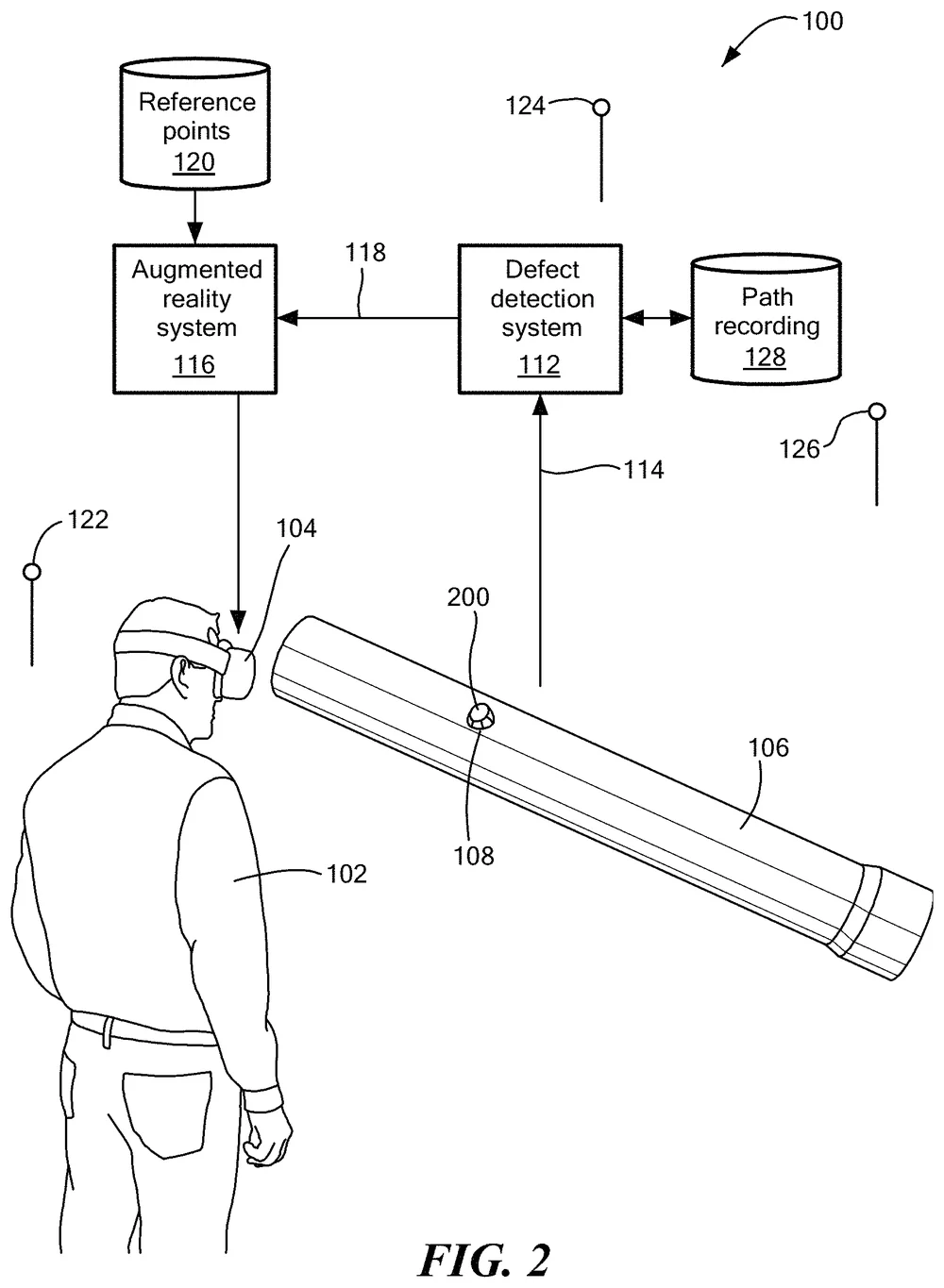
The occlusion work and the experiments like it were abstract. The heuristics and design principles they produced needed a real problem to prove themselves on. Pipe inspection was the first application we built, on an industrial use case: grounded first in interviews with industrial experts, then designed with the principles the exploratory studies had given us.
Refineries and chemical plants run miles of steel pipe that corrodes from the inside, and inspectors have to find the damage before it fails. Magnetometers can find corrosion inside a pipe and estimate how much wall is gone, but a pipe in a refinery is wrapped in insulation and cladding, and the only way to mark the defect is paint on the outside. Repair means removing several layers of insulation and cladding, and the mark goes with it; sensors taken off for the repair must go back in exactly the same place, or the next reading can’t be compared with the last. The inspectors lost the location in the act of reaching it.
Picture the inspector walking into the unit. There are dozens of pipes on the rack, all wrapped in the same gray cladding, and somewhere in there is the one with a problem. She doesn’t need to know anything about it yet except where it is, so that is all the headset gives her: a red band around one pipe, visible through the pipes in front of it. She walks to it. Standing at the band, she holds her gaze on it for a second or two, and the data comes up out of the steel. Sensor points lift from the band, and a relief forms over them, standing farther off the pipe where more wall is missing. The relief is the negative space of the corrosion: where metal is gone inside the wall, the surface swells outside it, so she reads the damage the way she’d read a dent. Beside each sensor she can call up its wall thickness over time, pinned to the sensor by a line, with the repair threshold marked, so the trend and the decision sit in the same glance. Where a sensor has been removed, a ghost shows her where it goes back. A failed one is a different color with an arrow on it. Then she does what inspectors do: she strips the cladding and pulls the insulation. The paint mark she used to rely on would be in the scrap pile by now. The relief is still on the steel.
| Inspector need | Design choice | Design principle | Heuristic |
|---|---|---|---|
| Find the damaged pipe among dozens, some hidden behind others, then read the damage without stripping it | Red band visible from across the unit and through pipes in front; up close, a held gaze lifts the sensor points and a relief forms | Progressive disclosure, by distance and by focus; see through the obstruction | 4, 7, 8 |
| Read the damage without a legend | The relief: its height is the missing wall, so it reads as a dent | Natural cues, i.e., data mapped to a phenomenon the eye already knows | 1, 2 |
| Keep a sensor’s state, position and history at the sensor | Failed sensor in its own color with an arrow; ghost where a sensor was mounted; thickness-over-time chart pinned to it | Group context with the object | 1, 5, 7 |
| Keep the defect’s location while the cladding and insulation come off | The hologram stays on the steel as each layer is removed | Anchor to the referent, not the surface | 5 |
The pipe design became U.S. Patent 10,564,127, “Augmented reality visualization for pipe inspection”.